Portfolio
Although a lot of my work is spent collaborating with awesome designers, here are a collection of projects where I took on the role of designer.
Call of the Brave
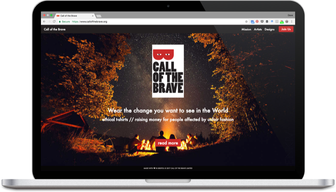
I built the platform for Call of the Brave iteratively. It started life as a simple static website that used a crowdfunding plug-in to collect pre-orders for t-shirt designs.
I used guerilla testing to get feedback on my designs. "Getting out of the building" enabled me to understand what people needed from the landing pages.
The logo was designed by a brand consultant and was also used for tags inside the t-shirts. I kept the dimensions of the tag for the logo on the homepage.
Later iterations of the site were built with Material Design UI components.
cxpartners microsite
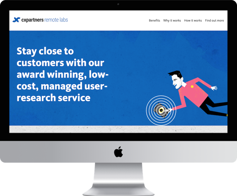
At the start of the pandemic in 2020, I was given a brief to create a microsite to promote cxpartners' new remote labs service. Using illustrations from our marketing materials, I designed and built a one-page site that showed off our new offer.
The site is still live: remotelabs.cxpartners.co.uk
Bristol Central Counselling
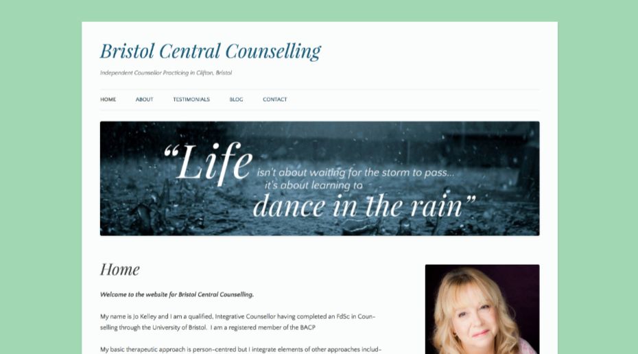
Jo reached out to me after she had set up a Wordpress.com website for her new Counselling practice as she felt it "didn't look quite right".
On a limited budget and constrained by the limitations of the basic theme, I made a few tweaks and implemented what Jo hadn't been able to:
- I improved the layout and removed unwanted Sidebar elements,
- I recreated her banner image using Adobe Photoshop so the font families matched the theme,
- I replaced the Wordpress footer with a call-to-action.
Recent work — invite
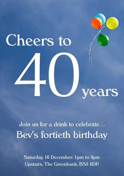
I still keep my hand in whenever possible. Last year, I designed an inivation for a low-key birthday celebration.
Recent work — JavaScript Glossary
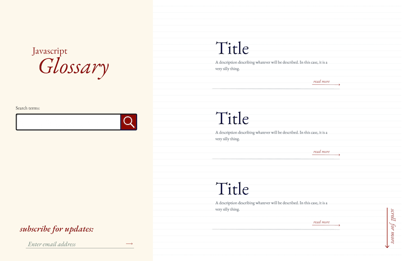
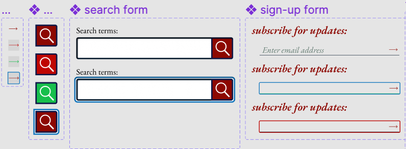
This was a side-project I started to learn how to use Figma. I created components, variants and page layouts for a microsite for looking up definitions of JavaScript terms.
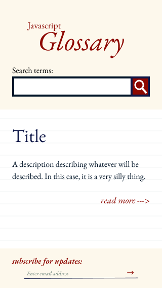
Mobile version of design.
Next
Why not read my thoughts about UX and UI ?